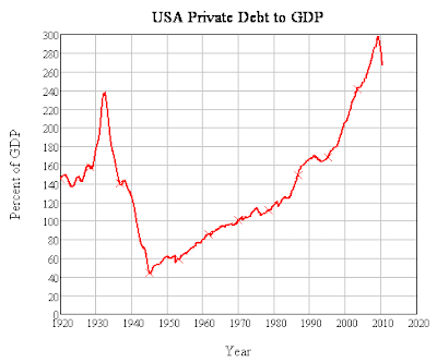
 Source: Steve Keen's deflation blog
Monday, September 20, 2010
Comparison charts between private debt to GDP ratio and income distribution over time
 Source: Steve Keen's deflation blog
Subscribe to:
Post Comments (Atom)
News and views from the foothills of the Rocky Mountains in Alberta, Canada
No comments:
Post a Comment